'Scenes of McAuliffe' WIP Thread

heres a quickie little update, a quick painter sketch of the asjaka. i got to thinking about the overall design ideas that i've been developing, and thought back to some early post WWI pre-WWII bombers, and came up with this puppy for the Kilrathi Asjaka...which, if i remember right was the ship that did the torpedo test.

enjoy :)
 

Attachments

  • asjaka.gif
    asjaka.gif
    25 KB · Views: 129
I really like the first version. The second one looks too human IMO. I think what throws it for me is the overhead wings. If you switch those to be more in the middle of the ship it might look better. Good designs either way, nice work. :)
 
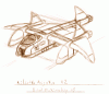
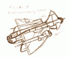
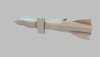
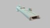
I think it's an excellent ship design, but I think it needs some alterations to be an Asjaka.

The Asjaka is described as being a "three-seater bomber", with this internal layout: "The view was over the shoulder of the bomber's pilot and thens hifted to focus in on the screen of the weapons officer." - That, to me, indicates that the seats are sort of like a B-17... with a bombadier at the front and a pilot in the middle (though closer together than a B-17).

The third seat would probably be a rear (or top) gunner. The novel also mentions that the cruiser it's attacking is viewer "Through the forward port of the bomber...", which to me implies that there's a facing forward cockpit separate from whatever the gunner is looking out.
 
ah, wicked! thanks LOAF, i was re-reading it last night, but fell asleep...hehehe. i'll fix up the nose, make the pit a bit smaller, and add a defensive turret to the top :)
 
finally!

here go folks, a bit of an update, this time...the Concordia :)

still have details to add, the tower to redo, front end to detail....sides to detail....hanger bay to detail...engines to detail....heheh...lots of work, but the hull is coming along.

Brad Mick
 

Attachments

  • new_conordia_01.jpg
    new_conordia_01.jpg
    86.9 KB · Views: 256
When you are used to the boxlook this version looks good and strange at the same time...but since I know what things you can do it will surely look great in the end.
 
understandable.

boxy drives me nuts. not a whole lot you can do with it. and i'm convinced that had the engine not been so limited, they'd have done more wc2 lookin ships.
 
In that case I am quite happy that the engine was so limited..the Kilrathiships looked like StarTrek ships. WC1,3,4 and 5 look like they are from the same designer WC2 is out of the line at least for the Kilrathi design..wc2 confed ships where more fitting to the rest.
 
eh, not really. Prophecy and WCII look more like they belong together, and wc 1 and 3 look like they belong together. aesthethically, i can't stand blocky. it drives me nuts. its boring, really nothing to look at. but, meh....i'm hoping to find some time soon to do some more work on the connie, got other more pressing projects i'm working on at the moment. soon! (heheh...everyones favorite word ;))
 
In my opinion, WC1 and WC 2 are the closest together of all the WC ships. I felt the ships on both sides in those first two games were very similar in look and general feel to each other. WC3 made a big change with ships like the Arrow and such that were quite a bit different in appearance from the previous games. But then again, that's just my opinion. Not to mention the color schemes were quite different in 3 on up
 
i basically agree with striker, exept for the kilrathis ships. the only wc2 era ship that looks in line with wc1 is the hakaga. the others look like centauri-romulan hybrids(a vorchan with warp-pods)

funny thing is, the sivar is totally out of line with any other kilrathi desing
 
Back
Top