
You are using an out of date browser. It may not display this or other websites correctly.
You should upgrade or use an alternative browser.
You should upgrade or use an alternative browser.
Screenshots Release Thread
- Thread starter Tolwyn
- Start date
Sylvester
Vice Admiral
Lynx said:I've just played around with the Caernavons glowmaps and added those light coneson the bow. Does it look good?
The Canearvon has never looked so good.
Also, what software do you use to make the actual models and how can I get it.
The carnaevan looks pretty good, the light is shining on the confed-logo,
such a light was on the midway too, shining on her name-plate, this is
always a goog effect.
I will have the caernaven overworked this afternoon, I send you the TC-Variant
for more experimens here. Oh, and I leave the forward Radardish as it is, for the
love of peace
such a light was on the midway too, shining on her name-plate, this is
always a goog effect.
I will have the caernaven overworked this afternoon, I send you the TC-Variant
for more experimens here. Oh, and I leave the forward Radardish as it is, for the
love of peace
(Was trying to say "good effect") 
@Lynx , one more thing. I overworked the sheffield yesterday and I use
the bussard-collectors, which U created for the Tallahashee .The old sheffield
used the same that is actuall used on the carnaevan here.
I would like to replace this on the frigate too, or does it mean any trouble for
your shinemaps ? You can surely include this one too, right ?
Tolwyn
Vice Admiral
Lynx said:I've just played around with the Caernavons glowmaps and added those light coneson the bow. Does it look good?
true...
speaking of glow maps. They have to be revised. The light cones are too hard edged. The effect looks too playne, for example on Caernaven's bussards. I suggest to add a little edge glow on all glow maps creating an illusion of volume lightning
The light cones aren't too hard-edged in my oppinion. I stole that idea from the Earth Alliance Hyperion heavy cruiser and the light cone is about the same there; it's a spotlight after all, their lightcones have always hard edges. The volumetric light effect for the buzzard intakes proved to be impossible with the texture alignment as is, but fear not, since currently, I'm adding additional detail to the model in TS, I'll figure something out. ")
@Sylvester: I use two programs for creating textures: MGI Photosuite for doing the base texture, and Photoshp for adding effects as dirt, light-, reflection and additional effects, and Truespace for modeling. but if you ever consider 3d modeling, avoid Truespace at all costs. It's quite unstable, and loves to throw holes in your model and ruin them for mysterious reasons.
and the light cone is about the same there; it's a spotlight after all, their lightcones have always hard edges. The volumetric light effect for the buzzard intakes proved to be impossible with the texture alignment as is, but fear not, since currently, I'm adding additional detail to the model in TS, I'll figure something out. @Sylvester: I use two programs for creating textures: MGI Photosuite for doing the base texture, and Photoshp for adding effects as dirt, light-, reflection and additional effects, and Truespace for modeling. but if you ever consider 3d modeling, avoid Truespace at all costs. It's quite unstable, and loves to throw holes in your model and ruin them for mysterious reasons.
Tolwyn
Vice Admiral
Lynx said:The light cones aren't too hard-edged in my oppinion. I stole that idea from the Earth Alliance Hyperion heavy cruiser
I was talking about windows, dude. for example on the CAernaven
B
BobMcDob
Guest
It needs more color
Eder
Mr. Standoff
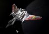
Well, the 3d model, at least, is too freaking pretty to be true.Lynx said:How do you like that Sabre?

Andropolos
Spaceman
That Sabre IS pretty.
I've decided to bend to the will of the mob I'll add some blue parts to make it look more colorful.
The model, by the way, is an Eder. After our super-sexy female agent drugged Eder, my special WCS model aquiring green beret squad stormed his house and took his most beautiful 3d models while inflicting the maximum posssible damage.
I'll add some blue parts to make it look more colorful.The model, by the way, is an Eder. After our super-sexy female agent drugged Eder, my special WCS model aquiring green beret squad stormed his house and took his most beautiful 3d models while inflicting the maximum posssible damage.
Eder
Mr. Standoff
Women, drugs, and 3D models... I don't mind taking the "maximum possible damage" from any of those sources.
Lynx, since you're gonna rework the textures anyway... I think the plating lines on this one are a bit more evident than in your other models... At first glance I actually thought you had kept the lines I used in my textures - but then I realized that a) you don't have the layered PSD version of my textures and b) the plates on the wings are very different from mine. Try using narrower lines, or eliminating a few of them... it just looks a little different to me than, say, the Crossbow or the Broadsword. Maybe it's just me.
As for the coloring, try some varied low-saturation hues. Think of the ships in WCP.... they didn't look too colorful, they actually looked convincingly metallic to me, but they used all sorts of grayed-out tones (light blue on the Vampire, brown/copper on the Devastator and Shrike, two different shades of blue on the Tigershark, etc...). I dunno, try coloring the center of the hull, or the intakes, or the central intake on the bottom, or the round pod things near the guns to a color you choose, then maybe add some yellow and red "generic-warning-label" details near the intakes and cockpit, etc, etc.
Anyway, my point is... it looks like you used two shades of gray (darker on the center, brighter on the areas that were white in WC2)... instead, I'd use a single shade of gray (I mean, the whole point of gray is looking like the metal's natural color... and why would the metal have two natural colors?) and replace the other shade with a low-saturation blue, with maybe some darker blue markings, and make the ones on the wings darker blue too. Or vice-versa, lighter blue on the markings and darker on the hull. I dunno, just my 2 cents.
Lynx, since you're gonna rework the textures anyway... I think the plating lines on this one are a bit more evident than in your other models... At first glance I actually thought you had kept the lines I used in my textures - but then I realized that a) you don't have the layered PSD version of my textures and b) the plates on the wings are very different from mine.
Try using narrower lines, or eliminating a few of them... it just looks a little different to me than, say, the Crossbow or the Broadsword. Maybe it's just me.As for the coloring, try some varied low-saturation hues. Think of the ships in WCP.... they didn't look too colorful, they actually looked convincingly metallic to me, but they used all sorts of grayed-out tones (light blue on the Vampire, brown/copper on the Devastator and Shrike, two different shades of blue on the Tigershark, etc...). I dunno, try coloring the center of the hull, or the intakes, or the central intake on the bottom, or the round pod things near the guns to a color you choose, then maybe add some yellow and red "generic-warning-label" details near the intakes and cockpit, etc, etc.
Anyway, my point is... it looks like you used two shades of gray (darker on the center, brighter on the areas that were white in WC2)... instead, I'd use a single shade of gray (I mean, the whole point of gray is looking like the metal's natural color... and why would the metal have two natural colors?
) and replace the other shade with a low-saturation blue, with maybe some darker blue markings, and make the ones on the wings darker blue too. Or vice-versa, lighter blue on the markings and darker on the hull. I dunno, just my 2 cents.