Landreich

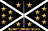
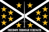
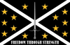
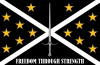
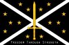
False Colors describes the flag: "...a white cross of saint andrew on a black starfield impaled by an upright sword, with the motto 'Freedom Through Strength' below."

Fleet Action describes the roundel: "...the blue circle and red Saint Andrew's cross of the Landreich."

I believe the Free Republic included fourteen systems (as of False Colors.)
 
Here's draft one of the Landreich flag. Any comments or suggestions welcome.

I tried to make the roundel but it looked like... well a blue circle with a red cross through it.. I'll post it when I make it look less like a traffic sign.
 

Attachments

  • landreich flag.png
    landreich flag.png
    128.7 KB · Views: 191
Real nice! Only thing I'd change is the color for the text. I think it would look better as another color.
 
I like it, but I wonder if it could be more '2D' -- like a clotch flag rather than a cool picture.
 
Not bad at all but it seems a bit busy. Maybe reduce the stars' size?
Perhaps you're right...

Also experimented with different positioning for the stars in the second picture but I don't think it works.
 

Attachments

  • landreich flag flat reduced stars.png
    landreich flag flat reduced stars.png
    92.3 KB · Views: 163
  • landreich flag flat different positions.png
    landreich flag flat different positions.png
    92.2 KB · Views: 177
I think the right looks less cluttered, but smaller stars might help either way.
 
Hmm, unsure. In this case, I think I prefer the right one for the same reasons as Chris but only by a small margin. I'd like to see it with smaller stars.
 
Your stars a bit "too fancy" for my taste - from the description in the book I always envisioned the background as a somewhat generic starfield:

False Colors p. 105:
"The flag of the Landreich dominated one entire wall, a white cross of saint andrew on a black starfield impaled by an upright sword, with the motto "Freedom Through Strength" below."


Ahh it just looked very similar to this one from a few years ago by Hammerhead in this thread

hehe, I completely forgot about that...
 
The more I think about 'starfield', the more I think tccgi et. al. are correct.

Some things (which can be readily ignored):

* Try using the same pattern as the 13-star or 15-star version of the American flag (there was never a 14-version)? It's an analogy Kruger would have appreciated...

13: http://en.wikipedia.org/wiki/Image:US_flag_13_stars_–_Betsy_Ross.svg
15: http://en.wikipedia.org/wiki/Image:US_flag_15_stars.svg

* Try using the same sword from the Confederation combined forces logo? It'd help explain it, since it exists to display the combined forces of the Confederation, Landreich and others...

Yeah ok, I think I got a good picture of what it should be now.
 
I'm a bit torn on the two latest versions, but I have to say they both look better than the NASA starfield flags which are so cluttlered with little white dots placed randomly that it strains my eyes.
 
I think the key is to imagine a clotch version -- on which the NASA starfield just wouldn't make sense.
 
... and speaking of pedantic, can you try a version with the capitalization used in the book (ie, "Freedom Through Strength" instead of "FREEDOM THROUGH STRENGTH") -- just wondering if it would look a little less imposing.
 
I figure as an art student I'll contribute something for a change... quick photoshop hack job of the last flags Wildcat did, but I think it does the job. Main problem is the combined arms sword, which needs to be redrawn rather than copy/pasted from Warbirds.
 

Attachments

  • landreich-tccgi.jpg
    landreich-tccgi.jpg
    157.7 KB · Views: 169
Also, I now wonder about 'impailed' -- should the sword go *through* the X rather than over it?
 
Back
Top