U
You are using an out of date browser. It may not display this or other websites correctly.
You should upgrade or use an alternative browser.
You should upgrade or use an alternative browser.
U
Unregistered
Guest
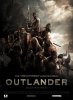
Thanks for showing us the poster . . .
That's a fairly interesting image. What do the (Spanish?) words say about it?
I see a pyramid of scared and focussed people, possibly mobilizing against an unknown threat.
Anyone else . . . ?
That's a fairly interesting image. What do the (Spanish?) words say about it?
I see a pyramid of scared and focussed people, possibly mobilizing against an unknown threat.
Anyone else . . . ?
AD
Finder of things, Doer of stuff
Thanks for showing us the poster . . .
That's a fairly interesting image. What do the (Spanish?) words say about it?
I see a pyramid of scared and focussed people, possibly mobilizing against an unknown threat.
Anyone else . . . ?
The reactions in the talkback over at "bloody disgusting" is pretty positive so far.
The poster is mostly a composite. There are most of the main Viking characters poised in various battle stances and topped by Caviezel holding a sword... and a neat Moorwen silhouette in the clouds.
AD
Finder of things, Doer of stuff
its cool but i'd like to have one or two actors names up there. also where's hellboy perlman? hopefully this version isn't the only one seen throughout the world. i'd like to see a variety and maybe a tag line as well.
I've updated the front page with an update... Check out the supersized version here: http://outlander.solsector.net/images/outlander_xlg.jpg
You might need to increase the brightness but all the cast and crew names are down at the bottom It's possible the scan was just dark. Perlman is the one at the front with the Hammers.
AD
Finder of things, Doer of stuff
that's perlman? it really doesn't look like him but the scan is dark so maybe so. also the supersized version you gave is smaller than the first one. maybe its my computer or my settings but i can't see the names. i'll keep trying.
you probably have to turn off automatic image resizing in your browser settings. Internet explorer probably defaults to it. It will make the picture fit whatever window you are looking at it in. Click on tools, internet options, advanced and then scroll down to multimedia.
thanks for the instructions as it worked this time. i still can't tell if its perlman but i'll take your word for it. also even by super enhancing it the names are barely visible. i'd like for the names to be in par with the director's name, perhaps at the very top of the poster. maybe the other versions will do something like that. its just nice to see some type of promotion and look forward to an official site or something. you know kind of like yours. ")
Schnellart
Spaceman
Love the poster!!! I hope this means a soon release of this film!
U
Unregistered
Guest
Amazing Poster...jim Looks Fabulous
U
Unregistered
Guest
I've been thinking about the poster for a day or so now . . .
I think it's wise to emphasize the "period piece" or "historical drama" flavor. Most movie-goers like that stuff. When I see John Hurt in a movie poster dressed up like its a thousand years ago I think "Oooooh, that looks interesting".
Then we see more Brits: semi-star Myles and proto-star Houston adds to the appeal.
Everyone recognizes JC on top, so that's good.
And then we see Ron Perlman . . . with hammers! He's looking half Quest For Fire and half Hellboy. This is promising.
Fjords, boats, LOTR . . . and a mysterious shadow looming behind . . . I'll go see it on the big screen.
PB
AD
Finder of things, Doer of stuff
I've been giving the poster some thought too. Overall it's a really great poster but there are a few issues that I think need addressed. First off I''ll begin by transcribing the Credit scrawl at the bottom of the sheet:
That's followed by the logos for Ascendant Pictures, Wild Bunch, VIP Medienfonds, and Dolby Digital. A few things stand out other than just the insane number of useless executive producer credits... I'll adress that in a second.
First it's that a few of the names are misspelled. It's possible this is final but I highly doubt we are actually looking at a finished poster. It's almost like the logo's are placeholders and would explain the horrible use of the white VIP logo. Also to the very left is the creators ID (who apparently also did the poster for Wildbunch's 'Largo Winch') I would assume the various credits on the list are correct but the misspelling would seem to indicate an unfinished product. It's probably designed to be adaptable to add a date and more localized credits for the distributors and for various ratings info etc.
Now about those credits... THere are really only TWO actual producers listed there (which differs slightly from the IMDB list but IMDB reliability is a question for a different thread) The rest are executive and co-producers. Sometimes large lists of these kinds of credits isn't a good thing as it usually involves medling but to some degree it wasn't entirely unexpected for outlander, partly because of it's long period in pre-production. And there's a few names that seem to be on here more as a formality than anything. So I really don't think that this is a big issue here.
For example, one discrepency between the IMDB list and here is that here Barrie Osborne is listed as executive producer which I feel is more correct whereas the IMDB lists him as a full producer. Part of this has to do with the fact that Barrie did help shape the looks of the film somewhat.
Back when the movie was supposed to film in New Zealand with Karl urban Barrie was overseeing all the preproduction artwork, animatics and stuff done by ninth ray and WETA. This work along with patrick tatopolous' early concepts did a lot to shape the look and feel of Outlander as a whole but that's pretty much where Mr. Osborne's involvement ends to which Don Carmody seems to have stepped into the role when the production moved to Canada. Don did a lot of PR work and helped the production get set up here in Canada etc etc so that it could meet the financial limitations imposed by the budget.
But then there's credits like Eberts and Jam who were a little more hands off as executives at Ascendant. IAIN MCCAIG gets misspelled but deserves a credit as he oversaw the art departments work in preproduction too. But then there's a few names I recognize as belonging to some of the financing companies and Vincent Maraval is one of the head guys at Wildbunch which is handling the international sales for distribution rights.
Then you might have the Weinstein company add a few of it's own credits. Michelle Krumm is Executive Vice President and Co- head of Acquisitions and Co- Productions at The Weinstein Company. One report said she apparently was overseeing OUTLANDER "in a production capacity." These people perhaps were involved in some maner in getting outlander made and or released but contributed perhaps very little to the actual making of the film whether it be art work, set or costume building, acting, or effects work, whereas the actual Producers (of which there are two listed) are actually somewhat hands on.
So this gets me to one of my main peeves with the poster which is the big letters that say "from LORD OF THE RINGS producer Barrie Osborne." I understand selling the films epic aspects and the need to market to a broad audience, but I think you get the idea from the artwork itself anyway. ( I don't quite get the likening of the poster to the one for 300 that I've heard online other than perhaps the lighting of the scene) But if he really only gets an exec. producer credit than people are going to look at that like a cheap ploy - a cash-in if you will. There are some similarities in costume design and stuff between this and LOTR and Tolkien is said to have taken some inspiration from Beowulf and other Norse things too, but I don't think it quite works for this poster. But I'm also not sure the text of this image is final either.
Regarding the artwork itself I don't really have any complaints. Of note though is that I'm pretty sure it's a painting even if it was done on a computer or touched up afterward. The artists doesn't seem to quite get hands right.
ASCENDANT PICTURES and VIRTUAL FILMS presents a VIP 4 production in association with RISING STAR "OUTLANDER" a film by HOWARD MCCAIN JIM CAVIEZEL SOPHIA MYLES JACK HUSTON with RON PERLMAN and JOHN HURT casting DEIRDRE BOWEN (CDC?) visual effects supervisor DAVID KUKLISH music by GEOFF ZANELLI
costume designer DEBRAH HANSEN editor DAVIV DODSON production designer DAVID HACKL director of photography PIERRE GILL (CSC?) co-producer IAN MACCAIG co-producer NEISHAW ALI executive producers CHRISTOPHER EBERTS KIA JAM executive producers DIRK BLACKMAN KAREN LOOP
executive producers VINCENT MARAVAL PHILIP ELWAY executive producer BARRIE OSBORNE executive producers ANDY GROSCH MARCES SHOEFER executive producers DON CARMODY produces by JOHN SCHIMMEL produced by CHRIS ROBERT written by DIRK BLACKMAN and HOWARD MCCAIN directed by HOWARD MCCAIN
That's followed by the logos for Ascendant Pictures, Wild Bunch, VIP Medienfonds, and Dolby Digital. A few things stand out other than just the insane number of useless executive producer credits... I'll adress that in a second.
First it's that a few of the names are misspelled. It's possible this is final but I highly doubt we are actually looking at a finished poster. It's almost like the logo's are placeholders and would explain the horrible use of the white VIP logo. Also to the very left is the creators ID (who apparently also did the poster for Wildbunch's 'Largo Winch') I would assume the various credits on the list are correct but the misspelling would seem to indicate an unfinished product. It's probably designed to be adaptable to add a date and more localized credits for the distributors and for various ratings info etc.
Now about those credits... THere are really only TWO actual producers listed there (which differs slightly from the IMDB list but IMDB reliability is a question for a different thread) The rest are executive and co-producers. Sometimes large lists of these kinds of credits isn't a good thing as it usually involves medling but to some degree it wasn't entirely unexpected for outlander, partly because of it's long period in pre-production. And there's a few names that seem to be on here more as a formality than anything. So I really don't think that this is a big issue here.
For example, one discrepency between the IMDB list and here is that here Barrie Osborne is listed as executive producer which I feel is more correct whereas the IMDB lists him as a full producer. Part of this has to do with the fact that Barrie did help shape the looks of the film somewhat.
Back when the movie was supposed to film in New Zealand with Karl urban Barrie was overseeing all the preproduction artwork, animatics and stuff done by ninth ray and WETA. This work along with patrick tatopolous' early concepts did a lot to shape the look and feel of Outlander as a whole but that's pretty much where Mr. Osborne's involvement ends to which Don Carmody seems to have stepped into the role when the production moved to Canada. Don did a lot of PR work and helped the production get set up here in Canada etc etc so that it could meet the financial limitations imposed by the budget.
But then there's credits like Eberts and Jam who were a little more hands off as executives at Ascendant. IAIN MCCAIG gets misspelled but deserves a credit as he oversaw the art departments work in preproduction too. But then there's a few names I recognize as belonging to some of the financing companies and Vincent Maraval is one of the head guys at Wildbunch which is handling the international sales for distribution rights.
Then you might have the Weinstein company add a few of it's own credits. Michelle Krumm is Executive Vice President and Co- head of Acquisitions and Co- Productions at The Weinstein Company. One report said she apparently was overseeing OUTLANDER "in a production capacity." These people perhaps were involved in some maner in getting outlander made and or released but contributed perhaps very little to the actual making of the film whether it be art work, set or costume building, acting, or effects work, whereas the actual Producers (of which there are two listed) are actually somewhat hands on.
So this gets me to one of my main peeves with the poster which is the big letters that say "from LORD OF THE RINGS producer Barrie Osborne." I understand selling the films epic aspects and the need to market to a broad audience, but I think you get the idea from the artwork itself anyway. ( I don't quite get the likening of the poster to the one for 300 that I've heard online other than perhaps the lighting of the scene) But if he really only gets an exec. producer credit than people are going to look at that like a cheap ploy - a cash-in if you will. There are some similarities in costume design and stuff between this and LOTR and Tolkien is said to have taken some inspiration from Beowulf and other Norse things too, but I don't think it quite works for this poster. But I'm also not sure the text of this image is final either.
Regarding the artwork itself I don't really have any complaints. Of note though is that I'm pretty sure it's a painting even if it was done on a computer or touched up afterward. The artists doesn't seem to quite get hands right.
is it common to include all these names for a promotional poster or is it something else entirely. it seems more like a informational piece with the hopes of selling it to more industry people and different markets for distribution purposes.
i agree with the lords of the ring reference for it feels out of place but i've seen it in other posters so it doesn't surprise me. i'm sure there will be multiple posters with different versions and i hope it would include some of the actors names. the best way to sell it is to let the audience know who's in it. it does look like a painting but its still appealing and peeks my interest even more.
i agree with the lords of the ring reference for it feels out of place but i've seen it in other posters so it doesn't surprise me. i'm sure there will be multiple posters with different versions and i hope it would include some of the actors names. the best way to sell it is to let the audience know who's in it. it does look like a painting but its still appealing and peeks my interest even more.
AD
Finder of things, Doer of stuff
is it common to include all these names for a promotional poster or is it something else entirely. it seems more like a informational piece with the hopes of selling it to more industry people and different markets for distribution purposes.
i agree with the lords of the ring reference for it feels out of place but i've seen it in other posters so it doesn't surprise me. i'm sure there will be multiple posters with different versions and i hope it would include some of the actors names. the best way to sell it is to let the audience know who's in it. it does look like a painting but its still appealing and peeks my interest even more.
YEah, It's typical to put all the credits on the poster somewhere. Almost every theatrical one-sheet has that at the bottom. They *should* be the same as the credits that would normally play at the start of a movie, and in that order too. Most DVDs will have it on the back of the case somewhere as well.
Bandit LOAF
Long Live the Confederation!
( I don't quite get the likening of the poster to the one for 300 that I've heard online other than perhaps the lighting of the scene)
I'd say it has some 300-derived elements, probably more from the movie itself than from its poster -- the warriors huddled together in that fashion and the whole 'color drenched while still finely detailed' quality of the image (and especially the sky.)
I would assume the various credits on the list are correct but the misspelling would seem to indicate an unfinished product.
"I think I understand what military fame is: to be killed on the field of battle and have your name misspelled in the newspapers." (Poor Chris Robert!)
Schnellart
Spaceman
Quoted from AD..."So this gets me to one of my main peeves with the poster which is the big letters that say "from LORD OF THE RINGS producer Barrie Osborne." I understand selling the films epic aspects and the need to market to a broad audience, but I think you get the idea from the artwork itself anyway. ( I don't quite get the likening of the poster to the one for 300 that I've heard online other than perhaps the lighting of the scene) But if he really only gets an exec. producer credit than people are going to look at that like a cheap ploy - a cash-in if you will. There are some similarities in costume design and stuff between this and LOTR and Tolkien is said to have taken some inspiration from Beowulf and other Norse things too, but I don't think it quite works for this poster. But I'm also not sure the text of this image is final either.
Regarding the artwork itself I don't really have any complaints. Of note though is that I'm pretty sure it's a painting even if it was done on a computer or touched up afterward. The artists doesn't seem to quite get hands right."
I have to agree...I think that the film would be so much better on its own merits without the reference to Lord of the Rings producer. The selling point should be the film itself and actors. If there is enough appeal (and I believe there is, just take a look at Jim Caviezel and John Hurt in that style of dress!) the film's attraction would be more or less the subject matter rather than having to bring 'Lotr' into it!
That being said I see quite a similarity to the colours from Lotr and also the way the 'Warrior with the Warhammer' on the bottom right looks to Gimli from Lotr too!
The last thing in reference to it being painted, I believe that to be true as well. The colour scheme being as it is with the detail and clouds appear more painted than computer. But I could be wrong. I also feel the hands appear a little poor and Jim's stance seems a little uncomfortable although he definately looks great! It is uncertain whether hes just trying to hold the sword up or not sure what he should do with it! I think i would have preferred him in a fighting stance!!!
[DVB]THUNDER
Spaceman
just my views...
I have to disagree with one of the previous posters who stated that Perlman in the poster looks too much like Gimli. There may be a slight resemblance, however I assure you once you see Ron, big man, huge arms, swinging two large hammers and causing carnage, you won't even have a reference to Gimli in your mind. Knowing his actions from the movie and having seen LOTR many times, he is not a Gimli clone. VERY far from dwarf!
Another lady/gentleman mentioned that it appears as though Caviezel was merely supporting the sword in the air, and not a fighting stance. Unfortunately it will always be like that. He did not at anytime look comfortable holding his sword in his hand. I will say it for Jack Huston, and the others they looked more "natural/at home" holding their weapons.