You are using an out of date browser. It may not display this or other websites correctly.
You should upgrade or use an alternative browser.
You should upgrade or use an alternative browser.
Kilrathi concept dralthi Bg image
- Thread starter lorddarthvik
- Start date
pygmypiranha
Vice Admiral
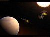
The wings on the ship on the right need a little better shading and the lines on the inside of the wing shouldn't be as bright.
I like the rest of the image tho. Very cool!")
I like the rest of the image tho. Very cool!
Lazy Panda
Spaceman
The shape looks nice, but the painting is a bit too hard-wired for my taste. Make a nice painting for the wings and it'll be good.
nice composition...maybe get closer in on the fighters though, and tone down the refelction on the planet. its not natural looking at all. i like the sun, i like the modeling on the fighter. Feng though, not the best for capturing the feel of Wing Commander. As much as i love his work (he's a freaking god) his style doesn't really fit WC very well. oh well. good job overall. just, i'd look into some more tuts on lighting in space and stuff.
Brad Mick
Brad Mick
Cyberion
Master of Orion
agreed on the reflection with Brad. It needs to be tweaked. Also fighters look to be self-shining, the look very bright on the overall background. Some shading would be nice, will make them more realistic.
And I love the sun, the sun is really nice there")
But anyway good work out there.
And I love the sun, the sun is really nice there
But anyway good work out there.
lorddarthvik
Spaceman
Hey folks, don't get angry on me becasue of that Batplane design, It wasn't my idea  I'V taken into account the noteworthy words and I'v made some adjustments. Update comeing up soon. And thanx for the ideas
I'V taken into account the noteworthy words and I'v made some adjustments. Update comeing up soon. And thanx for the ideaslorddarthvik
Spaceman
Now thats a logical point! I should turn em around?
lorddarthvik
Spaceman
Hehe, everyone's missing a closeup? LoL Guess why i didn't post one already! I dunno how to make it correctly detailed thats why! 
lorddarthvik
Spaceman
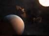
This is an interesting modified dralthi. I think its actually quite good. All the visible lines on the exterior of the fighter kind of remind me of the sharp angles of the F117 stealth fighter. This combined with the dark brown colour make me picture this as a sort of stealth variant of the dralthi.
BrynS
Mr Kat says...
Great work! Would you consider making a short video rendering?lorddarthvik said:...As i asid before, JPG compression is killin some detail though
Regarding the JPEG compression -- what's limiting your pics to 100KB? The forum's attachment feature or your hosting provider? I'd recommend ImageShack for image hosting: anonymous uploads up to 1024KB and if you register (just e-mail and password) for free you can keep track of your images.
Cheers,
BrynS
Lazy Panda
Spaceman
The Fly said:They somehow remind me of TIE-fighters... I wonder why?
That's probably because the wing drawings looks like panels... The TIEs had all black panels, this fighter has brown ones.
Oh, the new picture looks a bit better, but I'm just not familiar with the panel-look.
lorddarthvik
Spaceman
C'mon panda, take a look at the concept drawing, and then at other dralthi modells made by other members. There are PANELS, either you like it or not. soooory but thats the truth
but thats the truth