Galaxy get's a new look?

John Cordell

Spaceman
A new texture for the galaxy was created some time ago, what do you think of it?
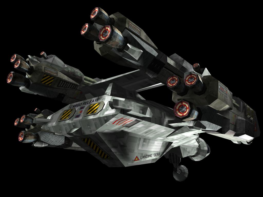
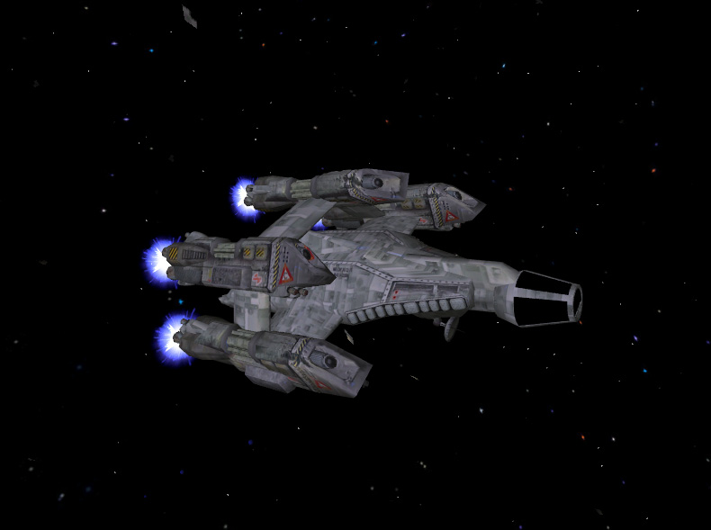
Any suggestions for improvements? I took some screenshots out of GG to show you the latest version...

galaxy01.jpg


galaxy02.jpg


galaxy03.jpg


galaxy04.jpg


galaxy05.jpg


galaxy06.jpg


galaxy07.jpg
 
Looking quite good. That galaxy in the background needs improvement though, the edges are a lot lighter than the rest of background.
 
Wow, that's ... um, just wow.

Lighting needs to be better though. If it was, I wouldn't be saying anything at all.
 
Looks good - I hate that reflection map.
I do have a few suggestions, though -
The panel lines are a bit obtrusive right now - if you tone them down you'll be good to go. Also it looks like the glow on the engine nozzles is still part of the diffuse texture. This is bad - it just doesn't look right. Move that over to the glow map, and it will look much better.
I could do this real quick if you like.
Other than those minor nitpicks, it looks good!
 
hurleybird said:
Looking quite good. That galaxy in the background needs improvement though, the edges are a lot lighter than the rest of background.

That reminds me to work on the background graphics again, they were done in a hurry as one of the last things before version 1.0 was released. Guess there happened some "mistakes"...
 
Howard Day said:
Looks good - I hate that reflection map.
I do have a few suggestions, though -
The panel lines are a bit obtrusive right now - if you tone them down you'll be good to go. Also it looks like the glow on the engine nozzles is still part of the diffuse texture. This is bad - it just doesn't look right. Move that over to the glow map, and it will look much better.
I could do this real quick if you like.
Other than those minor nitpicks, it looks good!

I pretty much agree on everything here, i'll see what i can do for the final version...
 
I second Howard's suggestions - everything is painted with a nice, subtle hull texture which looks pretty good... but then there are these really thick panel lines on top of the hull texture, and it kinda ruins the feel.

Also, I see a few plating lines which look like loose ends... they don't lead anywhere (ie: right above the cockpit), and IMHO that looks kinda weird. And I suspect the cockpit area is a placeholder? It looks awfully empty in that cockpit, so if you're not going to add detail to it you should probably drop the transparent windows.

And yeah, the lighting could be better (may be that everything is too bright, or more likely that the lighting is too evenly distributed), but I can't blame that on the poor Galaxy. :p
 
Eder said:
And yeah, the lighting could be better (may be that everything is too bright, or more likely that the lighting is too evenly distributed), but I can't blame that on the poor Galaxy. :p

Everything looks like it's washed in a brownish light. If the light looked more natural, the scene would look better overall. The Galaxy itself looks neat.
 
Yeah I just suggest making the panel lines a little less pronounced, lighter lines. Other than that I got no critiques. :)
 
I can tell you right now what the problem is - the mesh has been completely smoothed. IE the smoothing normals have all been unified and blended. This is a bad idea bad because it makes the ship look lumpy and undefined. Compare the following two shots - look specifically at the aft portion of the Galaxy - the part that says cargo release.
geminigold17.jpg

Now look at the same area in this shot:
galaxy02.jpg

See how the second one lacks any defination and "mechanical" feel? It looks like a lump of clay. However, look at the exhaust nozzles on the first one - they're very segemented and look wrong. The easy fix is to go part of the way between each of these extremes. Don't smooth the entire mesh, just the areas that need it - rounded and curved areas. Panels and gizmos and the like should be separately smoothed from the curved hull bits.

If you need more examples of what I'm talking about, just ask and I'll put up some more easily examined images.
 
Last edited by a moderator:
I have to agree with the comments about the cockpit... there is a great possibilty to have a really cool looking miniaturized version of the galaxy's cockpit in there. Instead, all that is there is a crappy chair and a crappier textured hatch at the back. This is a holdover from when I did the original texture... I replaced the cockpit on Brad's model because i was having a REALLY hard time texturing it. And then I figured it'd be neat to do a tiny 3d cockpit like I had done on the Tarsus before (not sure if that one's still there). Anyways, it looks half baked.

I'd set the mesh associated with the transparent cockpit to 100% opaque and a bit shiny to take care of the problem immediately and easily.
 
Howard Day said:
I can tell you right now what the problem is - the mesh has been completely smoothed. IE the smoothing normals have all been unified and blended. This is a bad idea bad because it makes the ship look lumpy and undefined. Compare the following two shots - look specifically at the aft portion of the Galaxy - the part that says cargo release.
I think I know what you're talking about. It seems to me this might be an issue with how the Vega Strike engine handles lighting, and not the model itself. Every model I've put into VS seems to have this effect. No idea if the switch to the ogre thing will have any impact.
 
Well, I know that's probably not true - I've placed my fair share of models in the VS engine over the years, and I've never run into anything like that. Then again, I've not done it lately.
 
Maybe it has something to do with how the lighting variables for the model are set. I only have an inch-deep understanding of what those variables do, and i use the same settings for all the models I play with. I suspect my lighting variables on the galaxy model remain unchanged.
 
howard day said:
I can tell you right now what the problem is - the mesh has been completely smoothed. IE the smoothing normals have all been unified and blended. This is a bad idea bad because it makes the ship look lumpy and undefined. Compare the following two shots - look specifically at the aft portion of the Galaxy
I agree. The VS engine is smoothing every model you import with mesher and mesher is the only tool with which you can convert models to the vs model format bfxm. You can't compare an external rendered model with the ingame look of it. If you want to compare something to decide which is looking better and which you prefer you have to compare these two:

geminigold14.jpg


cgalaxy02.jpg


PeteyG said:
I'd set the mesh associated with the transparent cockpit to 100% opaque and a bit shiny to take care of the problem immediately and easily.
That's propably a good idea because there's nobody who's going to create a cockpit for it.

PeteyG said:
I think I know what you're talking about. It seems to me this might be an issue with how the Vega Strike engine handles lighting, and not the model itself. Every model I've put into VS seems to have this effect. No idea if the switch to the ogre thing will have any impact.
Same experience here...


The new texture/model is the best one we have right now, far from being perfect but also ahead of it's predecessors.

1. Final Remake 1.0 texture by PeteG
cgalaxy01.jpg


2. WIP I
geminigold14.jpg


3. WIP II
cgalaxy02.jpg


I'll see what can be done for the final release and if PeteG or somebody else wants to help on the model (cockpit/texture) i can send it over...
 
Last edited by a moderator:
Back
Top