Concordia is gone

Wow - great image. The angle is certainly not a problem, guys. If you had taken a moment to actually LOOK at the original picture, you'd notice that there's terrain and mountains in the background. Behind the ship. That could mean anything - even that the Concordia came down in a bay of some sort. That means this image could have been taken from somewhere to the right of the original image, and thus the Concordia would be facing right, not left from that angle. The angle does not contradict the original footage. Just because it's seen from another angle does not make it wrong.
One the color side of things, it's really quite difficult to see what color she is in the original picture - it's so washed out with that atmospheric orange. Although to change the color of the ship would probably be trivial.
Anyhow, good work, Klavs!
 
Wow - great image. The angle is certainly not a problem, guys. If you had taken a moment to actually LOOK at the original picture, you'd notice that there's terrain and mountains in the background. Behind the ship. That could mean anything - even that the Concordia came down in a bay of some sort. That means this image could have been taken from somewhere to the right of the original image, and thus the Concordia would be facing right, not left from that angle. The angle does not contradict the original footage. Just because it's seen from another angle does not make it wrong.
Eh, I'm pretty sure I have "taken a moment to actually LOOK at the original picture..." :rolleyes:

The concordia's starboard side is considerably more sunk than the port side in Klav's render, while the opposite is true for the original render. It's not a matter of camera angle, as I'm sure you can see... You're free not to mind it, but it's still there.
 
It's still not a camera angle issue. Don't waltz into a thread rudely accusing people of not looking at what they're nitpicking on when you're the one who's calling an apple an orange. Like I said you're free to think it's a minor thing, and I'm free to nitpick about it... It's constructive criticism both ways.
 
Okay, let me apologize for my tone in the last couple of posts. It was rude of me to assume people didn't notice the terrain in the original image, and what it implied. I also didn't realize that the problem everyone had was with the listing to the side of the old girl, and not the direction she was facing. I'm sorry if I talked down to you guys, it wasn't my intent. I take it all back. I still think it's a lovely image, though - and I thank Klavs for making it. It'd be even more awesome if he'd go back and tweak a few things, but it's still pretty good without that.
Again, sorry.
 
Eh, it's no big deal at any rate... I do know I'm nitpicking, and as I said at some point I don't think anyone would mind the positioning or paint scheme at all if it wasn't such a memorable scene in WC history. And it is an awesome image, definitely.

It would make a nice "Doh, you have died!" credits screen background, though I don't really have any idea whether you guys have anything in that deparment. :p
 
Are you sure that's a rendered image?

*DR00000000L*

Whatever, it looks fantastic! You did a great job on it! I think you should congratulate yourself. :)
 
Eder: Yeah, I'm sorry bout that. Still, I really like the lighting and composition, even if it does differ from the original. But enough about that. Peace?
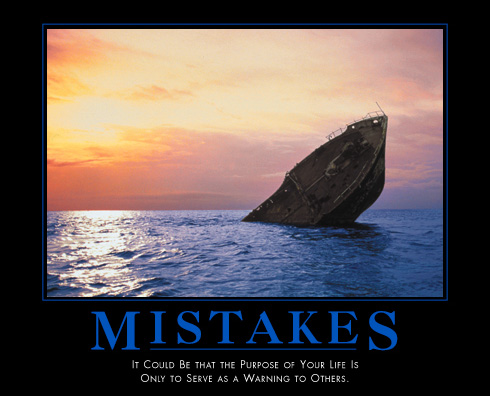
I just saw this, and it was too good to pass up:
demotivator-mistakes.jpg

The similarity was striking.
 
Are those dots on the deck of the render people?

That's kinda neat.

Speaking of which- you Saga guys ever going to post a screenshot of the Confederation Class for Saga? And is the Phase Transit Cannon going to be functional???
 
Whoops, forgot to log in.

Thanks everyone for your encouragement as well as your criticism.

I'm aware of the differences from the original material. The ship I had on hand is based on the Concordia, keeping her essential characteristics and reimagining her details based on my love for her universe and character, as are all my ships.

I didn't mean to upset anyone and hope I won't remembered in the same group of people as those who "made Greedo shoot first". I love the original scene and wanted to create a tribute, not a carbon copy of it.

Howard, thanks for your defense in particular. It's nice to have someone with the same passion and superior skill at your back. Cheers.

On ANOTHER note, a gold florin to whoever tells me what's different about my Rapiers! I know they're motion blurred, but what else...?

-A
 
Awesome picture, but I have to side with the nitpickers on this one. One more nitpick for consideration - there looks to be a considerable amount of water or something pouring off of the nose of the ship, since she had settled in the water for some time before being located, where's that coming from?

On ANOTHER note, a gold florin to whoever tells me what's different about my Rapiers! I know they're motion blurred, but what else...?

Dual wing mounted gun positions are a little odd?
 
McGruf is correct!

pickpickpickpickpickpickpickPICK! :p


So you know Klav I do like the image, but if you are going to create your own image of something that we have in-game images from be sure to accurately represent them in your own way. I'd love to see you do another image using the WC3 image more, the details on yours is great I'd love to see that more reflect the source material.

That being said keep up the good work.
 
Tolwyn-

Like just about everyone else here, I'd have to say that the first thing I noticed was that the Concordia was listing the other way on Mistral. And that the Concordia is sporting blue instead of green paint.

But ask me if I care? Not one bit. I think the render and composition is a gorgeous update of a defining image in the series. I like that Rapiers are doing the flyover instead of Hellcats. Sure, there are continuity inconsistencies but they're minor to me - the overall effect is striking. The official render showed the Concordia as a casualty and a tragic loss. I like yours because it suggests the Concordia at peace and laid to rest, a hero's grave for a mighty, long-suffering ship. I like.

I don't think that a little re-imagining of the venerable series is out of line so long as the character remains inescapably Wing Commander. My opinion on the WC3 Confed capital ships is that they looked too boxy and looked very unrelated to the designs in WC1 and WC2.
 
Back
Top