ChrisReid
Super Soaker Collector / Administrator
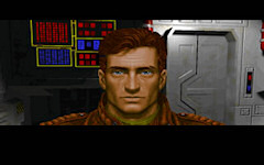
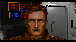
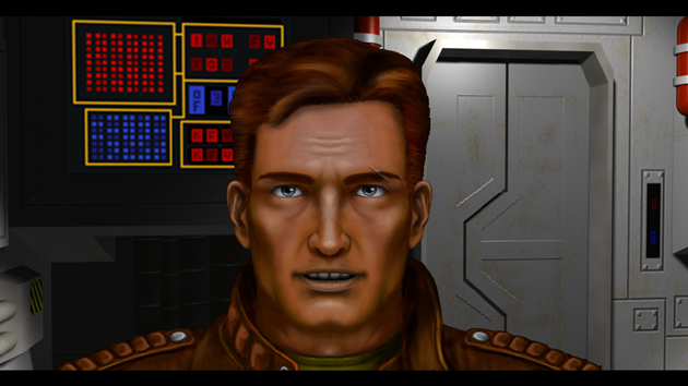
John Cordell and the Gemini Gold team has been working on a higher resolution version of the Grayson Burrows talking head. He's interested in feedback on the results so far. The original is on the left and new face is on the right. Do you think the new art is cool or creepy? Hit Discuss link below and let him know!
--
Original update published on December 2, 2008

--
Original update published on December 2, 2008
Last edited by a moderator:


")