A Slightly Altered Version of the WCP Map

Chuckles

Commodore
While the WCP foldout map is indeed a wonderful thing that expands the known Wing Commander universe and organizes the various locations found in chapters of our favorite franchise, there was really one the that bugged me about it.

The diminishing perspective slant. While it's stylish, it makes for bad copy cartography.

So, while I did this for another project I'm working on, I figured I might as well share it with the other Wingnut faithful. Perhaps you as well as they might find it useful.

It's about as close to a true rectangle grid map. There is some curving of the grid lines, most noticeably towards the galactic east. I decided against fudging those lines even further due to it messing up the alignment of the systems around there in relation to each other.

Anyway, hope someone can find some use for it beyond myself.
 

Attachments

  • WCPUM.jpg
    WCPUM.jpg
    1.6 MB · Views: 532
That's a cool way to look at it, but the original way never bothered me because they say right on the map that it's an Awkwende Projection. Considering that there's all sorts of various projections on maps today that do various distortions, this one seemed as good as any.

Akwende Projection

Named after Dr. Shari Akwende, the discoverer of the Akwende (or "jump") Drive. The Akwende Projection depicts stars based on hierarchical jump point routes, naturally occurring hyperdimensional passages linking neighboring star systems. Jump points allow instantaneous travel for spacecraft with antigraviton engines between linked star systems. This map does not portray the absolute positions of individual systems, as exact galactic positioning is irrelevant when considering current methods of interstellar travel. Rather, it is set up as a base navigational aid in plotting jump routes. Star systems on this map are organized according to galactic-sector and sector-quadrant to which each system belongs and its position relative to other systems in the region.
 
It didn't really bother me either, but for the purposes of the WCPedia, I think a flat projection works better for computer screens, so good timing!

(Now, if only we could get rid of those paper crease lines...)
 
There's not a lot that can be done to sharpen up the foldout map without smudging and a lot of subtle Photoshop alteration. If there was a pure square rendering of the map, that'd be for LOAF to confirm. It'd be a lot of effort to make it work when it is somewhat already stretched to the point of breaking down.

Beyond that, I do have the resources and materials to provide a reconstruction of the map in square layout format, with the level of detail going to the thickness of the nebula. It's close enough to a "I made a good looking map", but not so much a "You couldn't tell if it's official or not" level of quality. Yet.

I'd be up for trying to make the reconstruction look about as faithfully close to the original map, down to the little stars in the background, if it was desired/requested. I'd just need to add a layer of color to the various places of the nebula and smudge them together after some corrections, change the name fonts, change the system icons, a few other color corrections, and a fine eye for detail. I'll attach an example of what I'd be working from.

But yeah, I could do that.
 

Attachments

  • ExampleMap.jpg
    ExampleMap.jpg
    125.5 KB · Views: 289
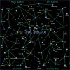
Alright, update time! Starting off simple, the Sol Sector seemed like the right place to begin. Also, I'd like to present what I'm doing more as a beta offering so you guys and gals can scrutinize my style and choices. After all, the attempt is to reconstruct it as faithfully as possible for the wiki, so feel free to spot obvious errors, offer corrective ideas, and chime in on what you think.

I've decided to hold off on the nebulae coloring, as I don't want there to be oddities between shades and thickness that are noticeable by quadrant squares. I'll do that job when the map is all pieced together. The same goes for jump lanes that cross sector borders, I'd like them to line up without a shift due to placement and the map's own weird warping.

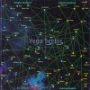
Out of all the fonts I have and researched, I could not find the exact matches for the lettering on the map, so I've compromised on what looks close enough and what reads clearly. I'm using Microsoft YaHei Bold at about 108 (for this map size) for the sector name and the system names, while switching over to Trebuchet Bold 40 for the quadrant names. With the quadrant names, it does seem very obvious whoever put it together is using some of the same techniques I'm using to reconstruct it, as I gotta compress the names horizontally to get them to fit just about the size they are on the original. I've also decided that only the sector name will have a slant, about 5 degrees, as the rest of the text seems slanted only by virtue of the Akwende Projection perspective.

I think the system icons are about as close to what they're supposed to be (on a square map presentation), as well as round and shiny. I gave them a subtle little shadow that will be more visible when the nebulae are recolored to make them pop out, but you can make them out in relation to the jump lines. The jump lines themselves have a little equal color glow around them to soften out the otherwise hard edges, which may or may not cause a little discoloration with the colored nebulae. I'll have to see when I get to the finished product.

The background stars are going to be interesting, well, interesting enough to probably cause me to seethe with obsessive, determined anger to get them to look right and work with the rest of the map. Considering there really isn't any available information on what they really are, I've done as best as I can to keep them scaled properly while being visible enough to actually be a pronounced part of the map. I suspect the background stars might be a subject of discussion, though I won't spend too much time thinking about them now, I've got maps to reconstruct.

Probably the biggest thing you'll notice as far as errors on the original is the misaligned jump lines to Cygnus. The distortion and copy error almost makes it seem Proxima Centauri jumps straight to Frase, and the jump lines from the southwest stop just before Cygnus. Additionally, E-Eridani seems to be either misspelled on the WCP final and preview maps, or it has been misspelled as E-Erandi on the rest of the CIC site. For now I'm using the map's spelling, but if it is, in fact, the map's error I'll change it to the correct one.

Without any more delay, here are the reconstructed version and the original for you to compare.
 

Attachments

  • SolSector1stPass.jpg
    SolSector1stPass.jpg
    330.7 KB · Views: 265
  • SolSectorWCPMap.jpg
    SolSectorWCPMap.jpg
    353.9 KB · Views: 212
It's looking good. I agree it probably makes sense to avoid the nebulous background, yet retaining those green background 'stars' helps keep it looking interesting.
 
That took a little less time than I thought.

Now what I meant by holding off on the nebulae, was that I wasn't going to completely eliminate it from the map. I got a few tricks up my sleeve that I think I can pull off to make it both a welcome addition to the map without letting it disrupt function. One of the reasons I like the WCP map is because of the variety of color in it, something most star maps of fiction completely avoid. I'd still like to make it a part of the reconstruction, just not this phase of it.

It got me thinking about the CIC's main map, the one with all the extra jump lines and nodes. I can't recall any material I've read that had the system layout and distribution of the main 12 sectors visualized as such. Not that I think it's wrong, just I've never seen the source material for it. Another project for another time, I suppose.

Anyway, Vega. Brimstone and Alcor suffer the same distortion as Cygnus in Sol. Also, after much scrutiny and time under the magnifying glass, I think we've been misspelling Acrux all this time. The pixelated pattern of the end of the name seems to look more like an "x" than "s". Since a good portion of the systems in the WC universe are named after actual stars, Acrux is also an actual star (Alpha Crucis). So allow me to put that out there as a probable wiki/site entry in need of correction.

As an additional feature seen in the preview map but not the final, I'm going to be super-highlighting the capital system of the sector. Although, the preview made did make some errors on that (like Gemini being the capital of the Gemini Sector as opposed to the actual New Constantinople), but lack of data on the other frontier sectors might leave me to take the information at face value.

Anyway, here's Vega.
 

Attachments

  • VegaSector1stPass.jpg
    VegaSector1stPass.jpg
    377.2 KB · Views: 216
  • VegaSectorWCPMap.jpg
    VegaSectorWCPMap.jpg
    402.4 KB · Views: 201
Now what I meant by holding off on the nebulae, was that I wasn't going to completely eliminate it from the map.
If you can add a nebula layer underneath all that, I think that would be nice too. But it still looks good even without it.

It got me thinking about the CIC's main map, the one with all the extra jump lines and nodes. I can't recall any material I've read that had the system layout and distribution of the main 12 sectors visualized as such.
Were you around when we were developing those maps? Those were fun times. If you missed it, we might have to search through the forums, try to find the threads where the project was discussed.

Actually, I'm thinking I'll probably have to: your registration date is 2005, and it was developed during my time at uni, in the early 2000s.

Since a good portion of the systems in the WC universe are named after actual stars, Acrux is also an actual star (Alpha Crucis). So allow me to put that out there as a probable wiki/site entry in need of correction.
I don't have the actual Prophecy map - LOAF will have to review this himself, as it's spelt Acrus in the CIC version.

...like Gemini being the capital of the Gemini Sector as opposed to the actual New Constantinople...
It's conceivable that the Gemini system is the sector capital while the administrative resources are located on New Constantinople station. I'm not too worried about it. :)
 
Were you around when we were developing those maps? Those were fun times. If you missed it, we might have to search through the forums, try to find the threads where the project was discussed.

Actually, I'm thinking I'll probably have to: your registration date is 2005, and it was developed during my time at uni, in the early 2000s.

Yeah, I was aware of the CIC during my first college days, just never got involved in the community back then. It'd be fun to peruse that process.

I don't have the actual Prophecy map - LOAF will have to review this himself, as it's spelt Acrus in the CIC version.

Just from what I've researched and looked at, the spelling of Acrux gets my lean because I'm scrutinizing the pixels on the map. Acrus has the advantage here as that was the initial interpretation, and that spelling has proliferated and been the standard so far.

It's conceivable that the Gemini system is the sector capital while the administrative resources are located on New Constantinople station. I'm not too worried about it. :)

It's not something I'd get worked up about, as it's something not featured on the published map. But for the case in point, if it was a business that has tax registration in one place, but is primarily based in another, I'd be fine with that. But the Privateer manual specifically states New Constantinople as the capital of the Gemini Sector. The WCP preview map highlights the name-sake systems of the sector, which throughout the WC universe tend to be government capitals of the sector of whoever is holding them (Sol, Vega, Kilrah). This is probably a case of someone forgetting the Privateer lore and marking Gemini as the "hub" (the Gemini system being invented for the WCP map as well, it wasn't in the Privateer game or materials at all), and thus New Constantinople is the exception to the rule.
 
This is one of the threads from the map development discussion.

Just from what I've researched and looked at, the spelling of Acrux gets my lean because I'm scrutinizing the pixels on the map.
I said we can leave this with LOAF or anyone with the actual paper map - it should be easy to read what it really is from there.

But the Privateer manual specifically states New Constantinople as the capital of the Gemini Sector.
I meant that New Constantinople is the political capital, but Gemini system is the sector capital. If that makes sense. It probably doesn't.

This is probably a case of someone forgetting the Privateer lore and marking Gemini as the "hub"...
That someone would be Captain Johnny, I believe. He posts here from time to time, we can ask him when he drops by.
 
Minor update, just so you people looking on know I'm alive.

A few other projects have cropped up that needed attention, so work on the next sector has been slow. But it progresses.
 
There is a Visio file of the map in the backup disks. It wasn't completely finished, maybe 70% if memory server me right, and with no pictures. I would probably look at that first. Easier to alter.
 
Just from what I've researched and looked at, the spelling of Acrux gets my lean because I'm scrutinizing the pixels on the map. Acrus has the advantage here as that was the initial interpretation, and that spelling has proliferated and been the standard so far.

You are correct, it is indeed "Acrux" on the printed map.

This is probably a case of someone forgetting the Privateer lore and marking Gemini as the "hub" (the Gemini system being invented for the WCP map as well, it wasn't in the Privateer game or materials at all), and thus New Constantinople is the exception to the rule.

Why did New Constantinople get the works? That's nobody's business but.... uh, Captain Johnny. I believe it was a combination wanting to have a 'name' system for each sector and forgetting the lore. We've taunted him for it enough over the years. :)

(I suppose the capital may have moved from New Constantinople to Gemini in the (nine?) years between Privateer and the WCU Map...)

If you can add a nebula layer underneath all that, I think that would be nice too. But it still looks good even without it.

I think the nebulae are necessary for creating a fully effective updated map. Look at how the known nebula from Wing Commander III (Ariel/Caliban) is represented on the original as a distinct area of space--that makes clear that they *are* part of the map rather than just a background.
 
Plus I remember WC4 having a few missions in nebula-infested systems. I forget specifically which ones, but I remember the purple goo in that game as well.
 
It would be nice to have a 3D map that would show the actual light years from the systems, though the Awkwende projection is the most important from WC perspective
 
Back
Top