Planetary Preview...

Howard Day

Random art guy.
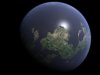
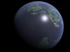
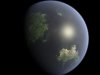
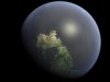
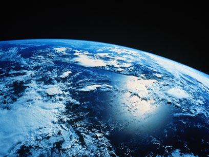
Okay, whilst I'm posting, I should share some of the preliminary map tests for our planets. Suggestions at this point are heartily welcomed - keep in mind that we've not even begun to touch clouds though. These planets will not have uniformly Californian weather when we're done.
They're all procedurals mixed with satelite imagery, so they're infinitely randomizable.
 

Attachments

  • eplanet1.jpg
    eplanet1.jpg
    80.1 KB · Views: 544
  • eplanet2.jpg
    eplanet2.jpg
    69.6 KB · Views: 446
The terrain itself is beautiful, and the atmosphere seems well done... but that big reflection really hurts the image. It makes it look like a marble.
 
The Atmosphere could be a little bit bigger and the speclight less strong and maybe not exactly round.
Also making different kinds of blue for the sea would be interesting.
Deep blues in the big oceans and a more lighter blue closer to the coast.
I like the land. Looks allready quite good.
 
Yeah, as mentioned the spec is a bit strong. Do you envision these planets looking like this actually in the game engine?
 
The solution to the SPEC problem, IMO, is to make the atmospheric effect much more pronounced, hiding the specular highlight behind the atmosphere.
 
Quarto - yup - too bright. Luckily, that's easily fixed.
Mr Unregistered - the atmosphere is already too big. It's not dense enough, but it's already too big. It should be about half what it is now.
Maj Striker: Yep. actually a fair bit better, because I'll have added clouds, city clows and better terrain, along with all the other stuff that's missing.
klauss: Yeah, that will help - the spec is too strong though, and just altering the atmosphere won't get it to where it needs to be.
 
And some more updates... fixed a bunch of problems, not the least of which was the specular.
 

Attachments

  • eplanet8.jpg
    eplanet8.jpg
    58.5 KB · Views: 349
  • eplanet6.jpg
    eplanet6.jpg
    59.6 KB · Views: 349
Its not the best but the landscapes are rally good
there is too much reflection highlight
i dont know if there shoud reflektion highlight it looks more than an metalic reflection
which programm u use for them ???
 
The glossiness and specular color are a definite improvement, but I think the specular level is still too high.
 
Uh, that specular is still really terrible.

Here's a couple of photos of Earth - shot one, shot two.

What don't I see in these shots? I don't see any specular highlights. Sure, water is reflective... but I don't recall any image ever where this effect would be visible from space. And definitely not to the degree that you've got.

Other than that, it's looking great - I especially like the shallow-water areas that you've added.
 
I stand corrected :). But that specular is still excessive IMO, and really detracts from the planet overall.
 
I think we should wait until we see it with clouds and stuff, and then make up our mind.;)
 
Back
Top