Heh. Nice.
I had the same idea for a CIC birthday submission a couple of years ago:
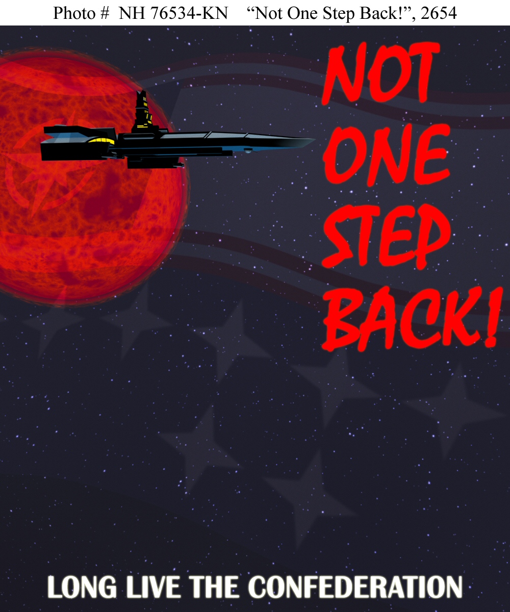
I didn't get to explain it properly then (because I was totally burnt out and somehow didn't think that whatever I wrote in the email would make it into the news burst) but it's modeled on U.S. Navy archival photographs, hence the white bar with Times Roman on the top, to give it the feel of an historical artifact. The actual design of the poster is modelled loosely on early-war Soviet propaganda; the graffiti-like-writing-in-blood colors style that was popular with
everyone in the Second World War; not so much in the First, oddly enough. It was a lot more popular with the Russians and Germans than it was with the British or Americans (though the
Australians had something
similar in the period immediately after Pearl Harbor).
Looking at it now, I probably made a mistake juxtaposing that phrase over what essentially is a serene image. It looks more like a peacetime recruiting poster than a wartime "BUY WAR BONDS" sort, and if I had decided on the text first I probably would have gone for a more muscular image. But the art was the part that was done first, and the text was literally slapped-on in the last few minutes. I'm not sure why I chose the text, I did, either - the idea here is that the battle for the Vega Sector is won (or at least in the balance), not that Confed is losing the war or on the verge of grave defeat. I think it was just mood - I'd just finished composing the image and was hysterically-exuberant; I needed a catchy phrase and I jumped to something hysterically-exuberant. I figured "LONG LIVE THE CONFEDERATION" was a good motto that would be on a lot of posters.
So, yeah. Sorry to go on like that. Looking forward to that second poster
")