Card Art Malf's Off (April 4, 2018)

Bandit LOAF

Long Live the Confederation!
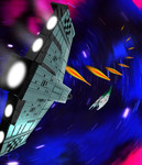
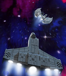
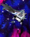
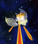
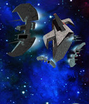
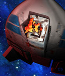
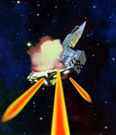
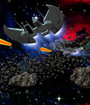
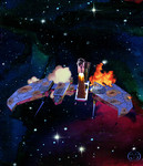
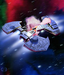
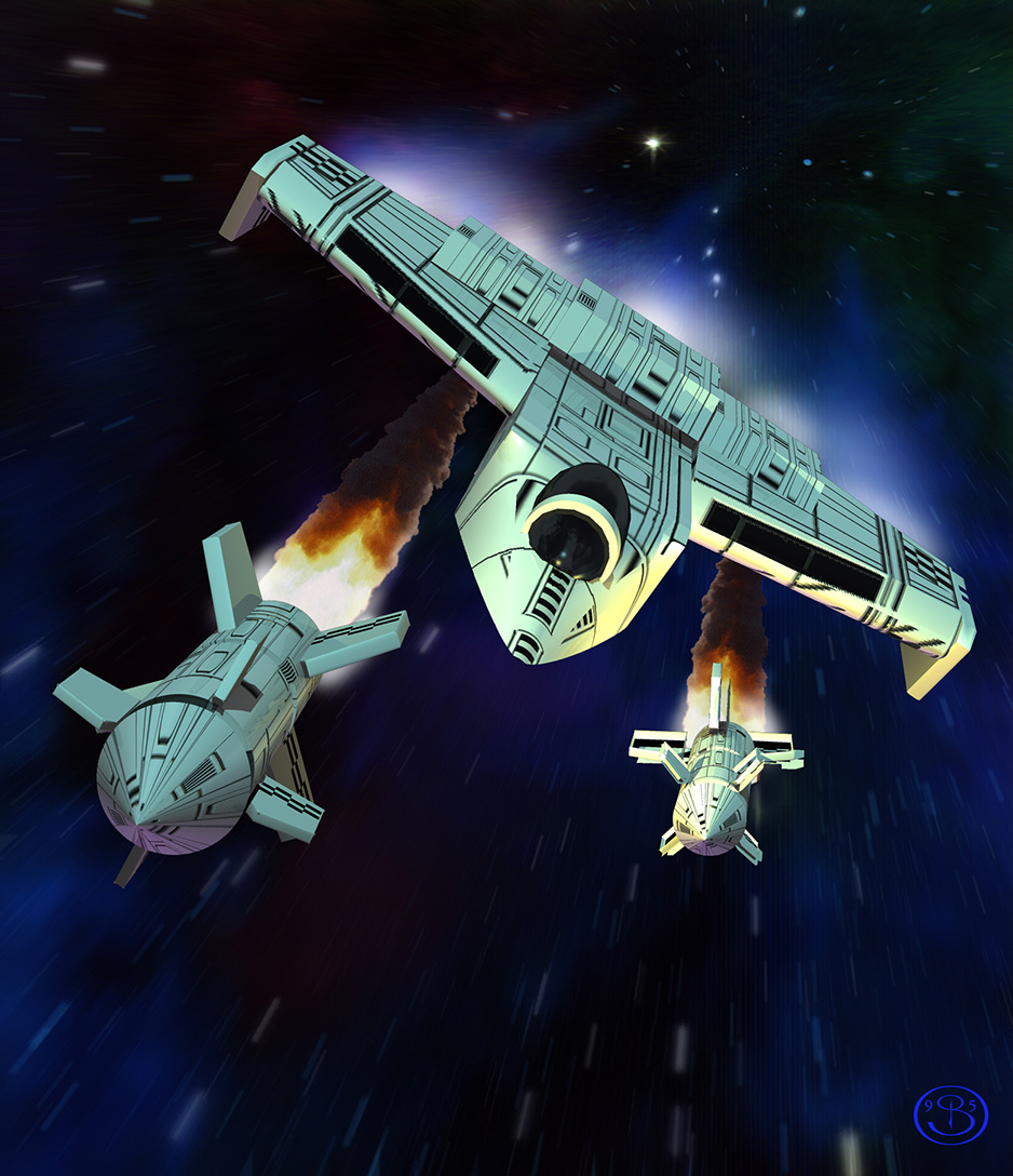
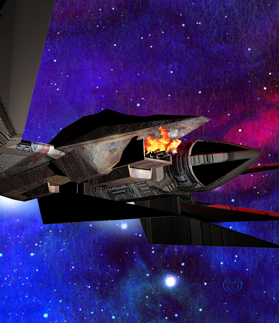
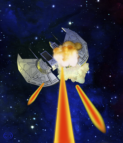
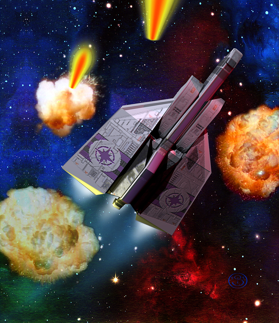
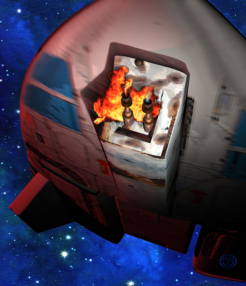
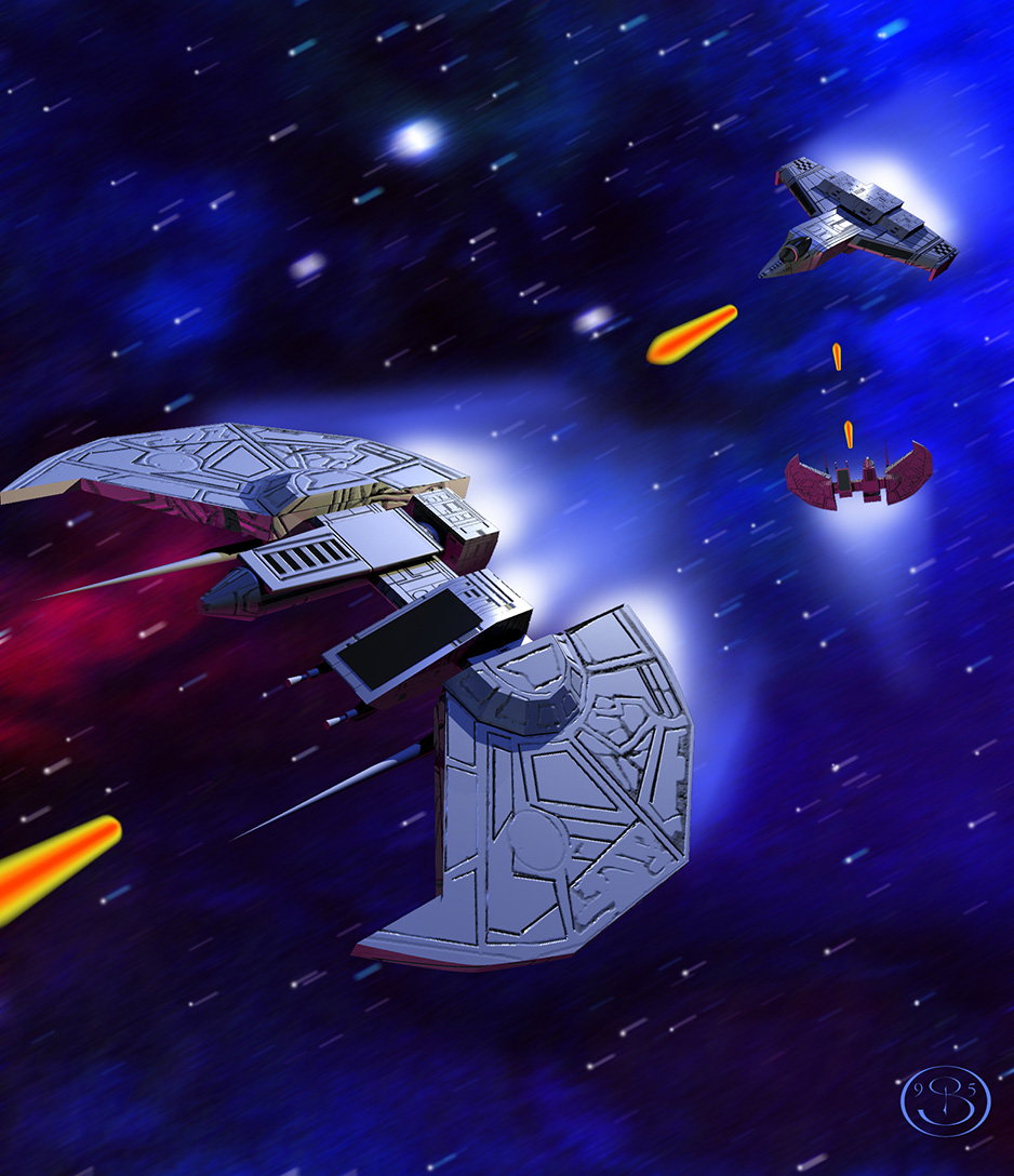
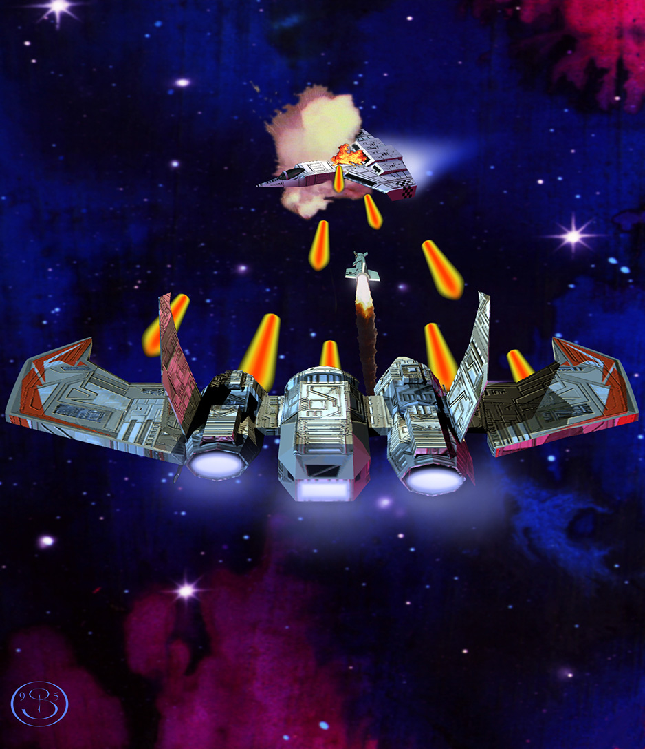
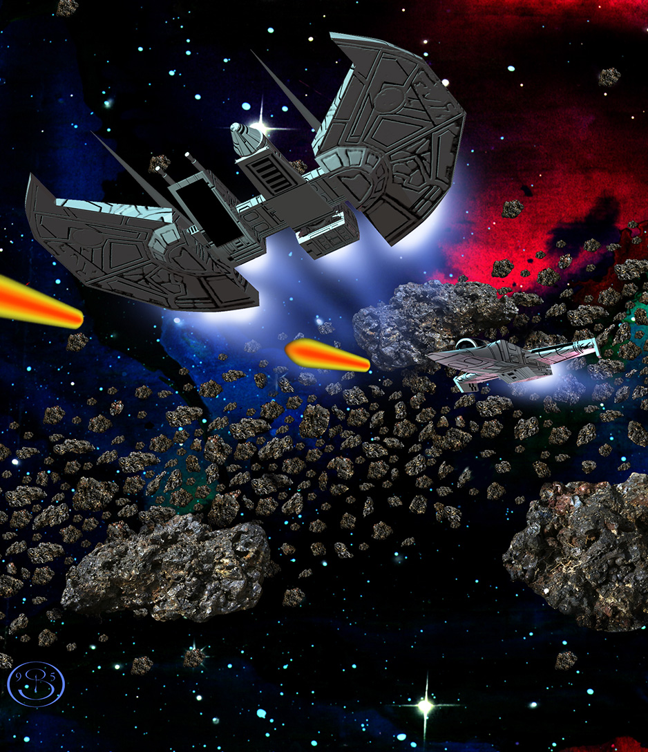
Here's a treasure: digital copies of fifteen pieces of artwork created for the Wing Commander CCG from Mag Force 7. While much of the card art created for the game used traditional paintings, several of the contributors chose to work digitally with early 3D models. The result is a subset of cards with an extremely cool look distinct from anything else in the Wing Commander canon. These pieces were created by talented artist Barclay Shaw, who was kind enough send them to us. Mr. Shaw writes: "I’ve attached a zip file of what I have; the files were recovered from a hard drive crash in the early 2000s and two of them are very low resolution. The artwork was a combination of painting, digital painting and primitive 3D renderings – one of my early forays into the digital art realm, pretty rough by today’s standards (scanner lines are apparent in the backgrounds) but it opened up a whole new world for me." Amazing stuff, and wonderful to see in such detail. I had thought the Terran 'Malf!' card was some sort of turret as printed; now you can see clearly that it's the underside of an Arrow fighter!


--
Original update published on April 4, 2018
 
Last edited by a moderator:
It certainly is cool to look at these as historical artefacts, but boy, they did not age well. No fault of the author, of course (who does acknowledge their roughness) - I think that's just the price of experimenting with new techniques, that early works are impressive for their innovation when first shown, but later as their innovative value declines, you're left with something markedly inferior to older and more established techniques. The use of 3D graphics in the mid-1990s is undoubtedly among the best examples of this sort of thing. Of course, in this case, a part of the issue is that we're looking too closely at art that's designed to be displayed small. As long as we're looking at these thumbnail-sized, they look fine; the moment you open one of them up to look at it in full size, you see all kinds of problems.
 
It certainly is cool to look at these as historical artefacts, but boy, they did not age well. No fault of the author, of course (who does acknowledge their roughness) - I think that's just the price of experimenting with new techniques, that early works are impressive for their innovation when first shown, but later as their innovative value declines, you're left with something markedly inferior to older and more established techniques. The use of 3D graphics in the mid-1990s is undoubtedly among the best examples of this sort of thing. Of course, in this case, a part of the issue is that we're looking too closely at art that's designed to be displayed small. As long as we're looking at these thumbnail-sized, they look fine; the moment you open one of them up to look at it in full size, you see all kinds of problems.
Yep, I was grinning awkwardly at the texture issues, having gone through similar results working on different projects.
 
And yet, they are so much better than the paintings. I always wondered how that many, really hideous card designs were approved. I mean it must have been painfully obvious that they looked bad and that that would hinder sales...
 
Back
Top