
You are using an out of date browser. It may not display this or other websites correctly.
You should upgrade or use an alternative browser.
You should upgrade or use an alternative browser.
Confed Flag Raising
- Thread starter =Shadow=
- Start date
Mekt-Hakkikt
Mpanty's bane
As much as I wish for it, I can't imagine he had ten volumes of WC designs. Still would be interesting to see some inspirations.
Bob McDob
Better Health Through Less Flavor
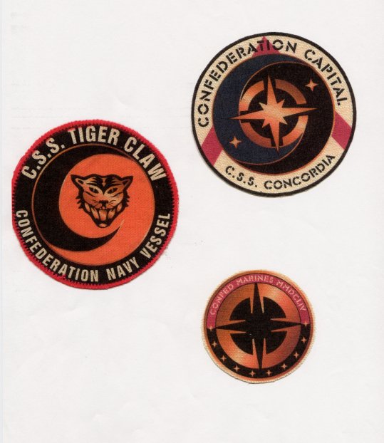
Yeah, he almost certainly means reference directories like Jane's and Conway's; you can clearly see the influence of Great War era dreadnaughts in particular here, much more so than in the final version.
Anyway, I've been putting this off for far too long, so here's a revised version of the flag, using the image earlier as reference. I kept the aspect ratio the same (though I keep having a nagging feeling it should be broader or narrower), but the stripes are thinner, and shaded slightly differently than the canton (which is a purplish hue). They're just placeholder shades right now; far too close to the point of being identical, but at the same time I'm not sure what else they could be (dark-dark red? black?)

As for the star, white is clearly no longer an option. I had thought earlier a shade of silver might work, but it would seem to be need to be a very dark shade, almost gray. I liked the aesthetic effect gold gave in the Landreich flag thread, but I don't think I would have tried it here if it hadn't already been done for the movie:

I don't really like the lower gold effect in the second version; too garish a contrast with the red for my taste. Here's the same with a slight white stroke around the edges:

Final word on that star: look at the one above and from the movie intro production art, and it seems to be the same version - much thicker outside arcs, much smaller secondary points. I didn't incorporate that here, since I wanted to put something out as quickly as possible, but it's something to keep in mind.
Anyway, I've been putting this off for far too long, so here's a revised version of the flag, using the image earlier as reference. I kept the aspect ratio the same (though I keep having a nagging feeling it should be broader or narrower), but the stripes are thinner, and shaded slightly differently than the canton (which is a purplish hue). They're just placeholder shades right now; far too close to the point of being identical, but at the same time I'm not sure what else they could be (dark-dark red? black?)
As for the star, white is clearly no longer an option. I had thought earlier a shade of silver might work, but it would seem to be need to be a very dark shade, almost gray. I liked the aesthetic effect gold gave in the Landreich flag thread, but I don't think I would have tried it here if it hadn't already been done for the movie:
I don't really like the lower gold effect in the second version; too garish a contrast with the red for my taste. Here's the same with a slight white stroke around the edges:
Final word on that star: look at the one above and from the movie intro production art, and it seems to be the same version - much thicker outside arcs, much smaller secondary points. I didn't incorporate that here, since I wanted to put something out as quickly as possible, but it's something to keep in mind.
Last edited by a moderator:
Interpretation of Confed flag
And i can't help but trying to do a little intepretation about what the colours actually represents. Usually the colour of the flag represents something. Although most people don't know that. I mean, there is a reason why a flag has a certain colour scheme.
Anyway here is my guess what the colours could mean:
Blue: Representing the sky of humanitys homeplanet: Earth
Gold (or yellow): I have to options here: Either it could represent the colour of wheat fields or grain or something else that makes fields go yellow.
OR it could represent the sun (a yellow dwarf)
White: That we are a peaceful race (or at least tries to be") )
)
Red: The blood that has been sacrificed for the freedom enjoyed by all citizens in the Confederation.
As I said, my suggestions to how to interprete the flag. Comments?
And i can't help but trying to do a little intepretation about what the colours actually represents. Usually the colour of the flag represents something. Although most people don't know that. I mean, there is a reason why a flag has a certain colour scheme.
Anyway here is my guess what the colours could mean:
Blue: Representing the sky of humanitys homeplanet: Earth
Gold (or yellow): I have to options here: Either it could represent the colour of wheat fields or grain or something else that makes fields go yellow.
OR it could represent the sun (a yellow dwarf)
White: That we are a peaceful race (or at least tries to be
)Red: The blood that has been sacrificed for the freedom enjoyed by all citizens in the Confederation.
As I said, my suggestions to how to interprete the flag. Comments?
Bob McDob
Better Health Through Less Flavor
I'm sure that the idea of it in context is it to mean *something* (that's the point of symbols, after all) - but my gut feeling is that the artist simply took the Confederate States flag as a springboard and reworked it into a mixed American Union-proper image. (You see this sort of thing occasionally throughout tha later series; the TCS Manassas, named after a seccessionist victory of the American Civil War and subsequently one of the first ironclad warships in the world - and of course the C.S.S. registry in the art, which of course comes originally from Confederate American battleships); that said, some nations (Taiwan/ROC) and Burma/Myanmar use red fields with blue cantons, so it could be from there, too. In the former case, it is occasionally used to represent basically what you described (with the exception of 'red as the blood of our people we shed for freedom' - that's something that gained a lot of popularity from the French revolution, but it certainly doesn't always or even usually mean that; I think that when Sun Yat-sen designed the flag he described it as representing the Chinese people and land.)
This is all really just an aside to what I really need to say here, though, which is: the gold is not clear anywhere on the original art on the flag. I used it here because there's clearly something there that isn't one of the established Confed national colors (red, white, blue) and gold appears in some of the preproduction art for the star and the movie - but I put it there in this reconstruction for aesthetic effect, essentially. It didn't clash badly with any of the other colors; it has a precedent; and it was needed because nothing else 'fit'. It's a 'best-guess' thing - even though the image in post #13 cleared up a lot of things, it's done far from clear up all of them, and I don't think that unless we get a high-quality view of the original art it'll ever be really settled.
Anyway, the movie decided to settle for sepia-toned art rather than color, so perhaps this is all besides the point.